The ASICS Blog
Get inspired to move with articles, tips, and fitness-related content by ASICS.
Project Summary
Description
Design a home for ASICS articles and inspiration. Implement a new CMS for regional businesses to easily upload and customize content.
The Team
My role: Lead Product Designer
Product Manager: Katie Muldoon
Project Manager: Hannah Duhaime
Engineer 1: Jac Wynn
Engineer 2: Archie Tio
Tech Stack
Figma
CMS Integrations
eSpirit CMS
Salesforce Creative Cloud
Project Goals
Customer Goals
Inspire users with ASICS-related content
Allow users to filter and search for topics of interest
Business Goals
Design a blog article page template for the business to update with images, GIFS, videos, tags, and written copy
Design a Blog landing page template that allows tagging for filtering purposes, and automatically pulls/updates from article pages
Design a CMS application with ease of use, customization, and design flexibility
Technology Goals
Implement a new CMS that will improve personalization capabilities and is compatible with SFCC
Gathering Requirements
The US and EU regions provided a list of requirements, which I used as constraints to guide the design. I checked off each item to ensure the design would be successful to the business:
Landing Page must account for 7 available content slots. Business users must be able to toggle how many content slots are available /showing at once (i.e. turn off content slots that aren’t being used)
Matches hero banner requirements from SFCC
Image slot that can support image, gif, video (nice-to-have for launch)
Must have room for article name, publish date
Nice to have
Ability to filter based on topic (i.e. Tennis, Product Recommendations, etc). Business admin should be able to add and manage filters over time
Quick & Dirty Research
With a one-week deadline to present final designs to regions, I needed to shift to a quick-and-dirty research approach. I scraped through various blog, media, and app design examples - ranging from competitors like fitbit and non-competitors like wedding website theknot (okay, I was getting married that summer so maybe I already knew what inspiration would come from this website). Throughout my search, I took note of how they presented their content and layouts, filtering UI, media types, and character limit/text break rules.

Ideation
From here I began the ideation process. Because this was an entirely new venture, setting additional constraints helped guide the design: Could I re-use content units we already have to minimize build time? How many dimensions of filters will we need? Based on the business requirements, which units will I need to design new?

Medium Fidelity mockups
I ultimately needed to design two different types of pages; the blog landing page (where the articles live), and the blog article page (where the article content lives). Within those pages, I was trying out where I could add current content units, and also designing new content units specific for the blog that could be easily placed by the business. 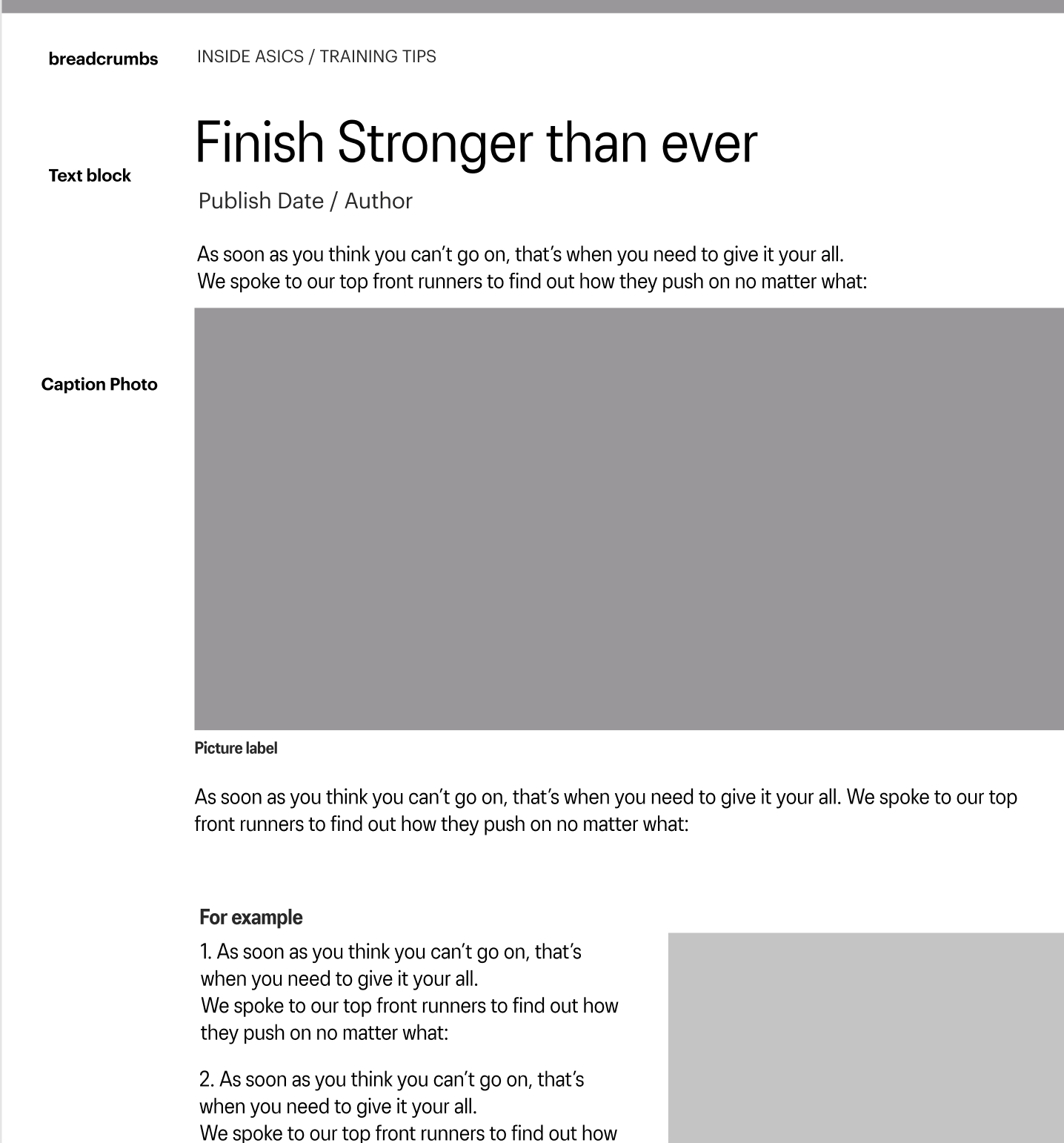

High Fidelity Mockups
After figuring out the technicalities of the design, I moved on to high fidelity. I presented two different options to the regions; one option that accomplished all of their requirements in the desired look they had wanted, which revealed issues in the design. So I presented a second option that accomplished their requirements with an optimized design based on research and usability.
At the same time, ASICS was undergoing a new brand refresh (with many unknown details at the time). Text sizes that had not been considered were now necessary because of the blog. For instance, we had only been working with 14px for body copy and 18px for labels. We did not at the time prioritize sizing for long-body copy. Our new font (ASICS 3.0) is more narrow - and less legible - than our previous font (Graphik). So, we ended up adding in a custom text block to the blog's CMS with designated sizing for hierarchy, as well as a new text size (16px) to help with legibility for long-body paragraphs in our articles.
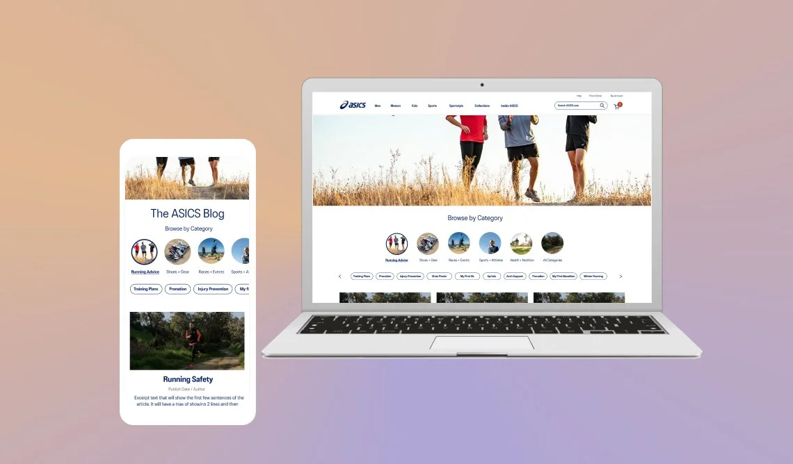
Landing Page
-

Option 1 (original requirements)
The regions had requested a hero image with copy, and to utilize the hero image we use on our homepage. They also requested a text block. On desktop this appears like a great design. But when we look at mobile, the text stacks on top of each other. This is because earlier in the year, we had moved text off of the hero image on mobile to make the image more prominent. Presenting the issues in this design helped persuade regions to seek alternatives.
-

Option 2 (optimized)
To solve the issue of text stacking on mobile, I created a rule that if text were applied to the hero image, the copy block could not be utilized below, and vice versa. In addition, to help with marketing campaigns and promotions, I created a new content block called. the “featured article”. This is a separate content unit that can be placed above the other articles so this content can stand out from the rest and be discovered.
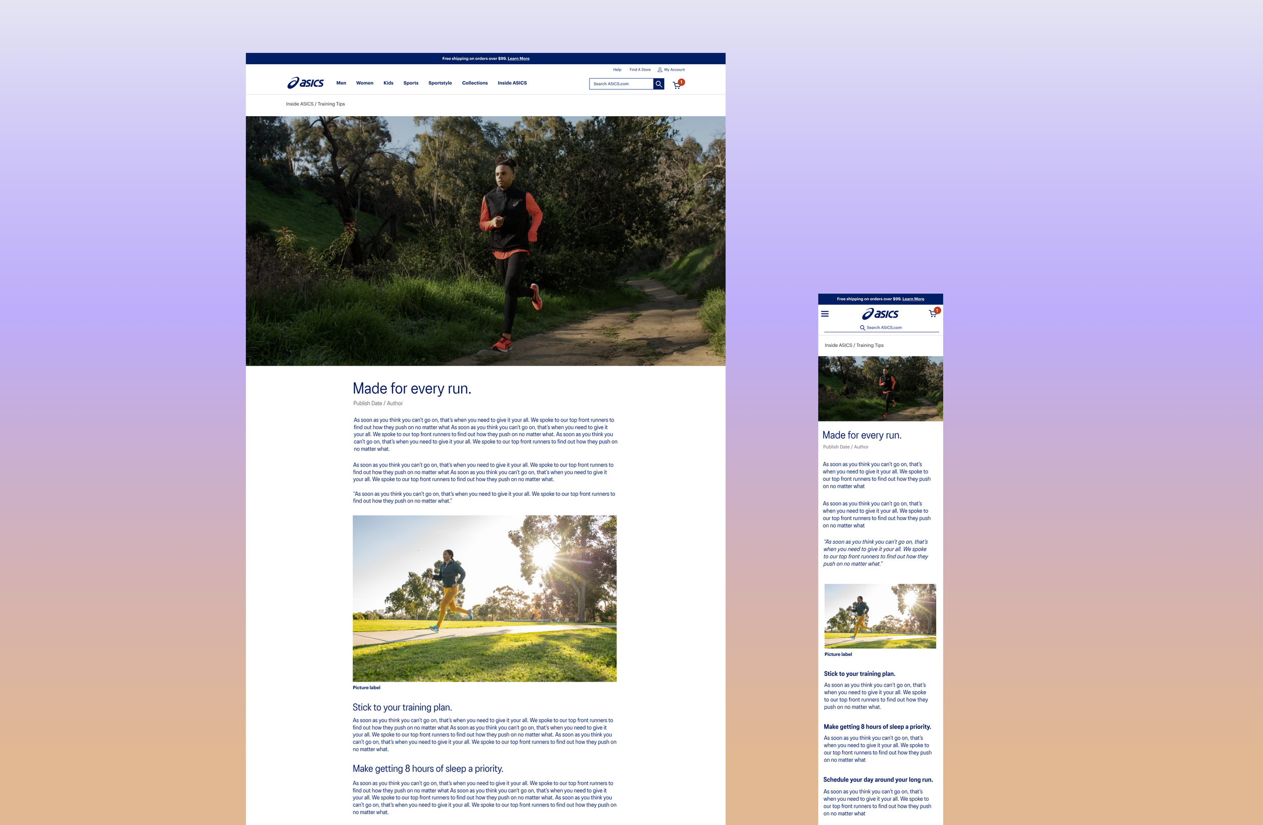
Article Page
-

Option 1 (original requirements)
I researched successful article text sizes, page width and text break dimensions on desktop and mobile for optimal functionality. I also utilized content units we already have on our website (i.e. a Caption Photo and Hero image) to reduce build time. While this design met all of the business requirements, I wanted to explore ways to make the content more engaging.
-

Option 2 (optimized)
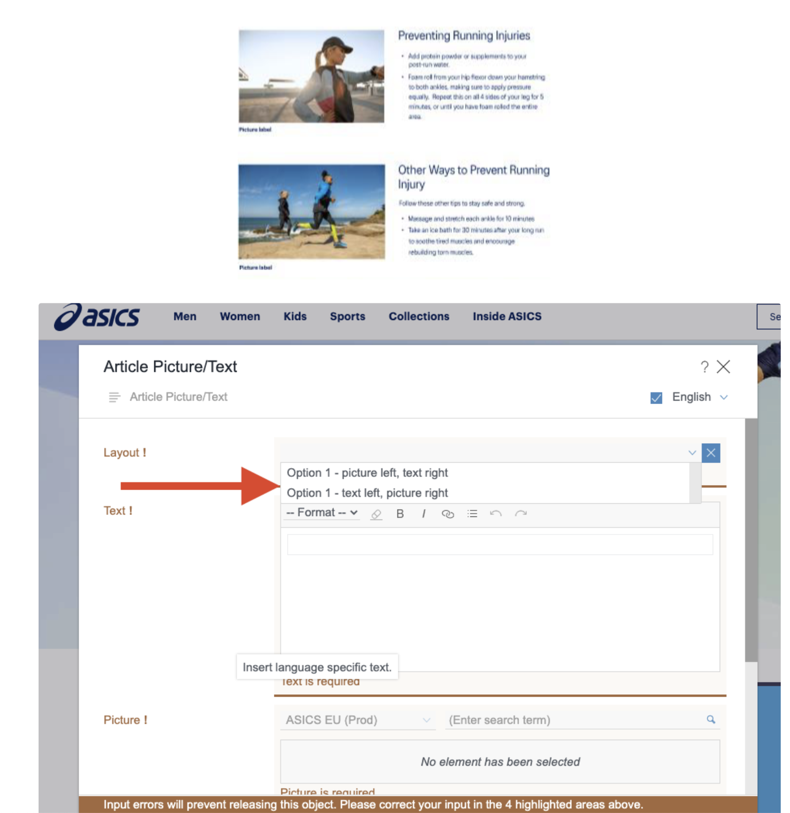
So I improved it. To improve usability, I moved the Title and text blurb sentence above the hero image. This is especially helpful on mobile where the user might otherwise not see the article text and bounce from the site. I also added a new content unit called “Article image with text”. This unit consists of a thumbnail image and text beside it, which is helpful for the content we are trying to display, such as; product recommendation lists, running tips, and other content that needs to be broken down.
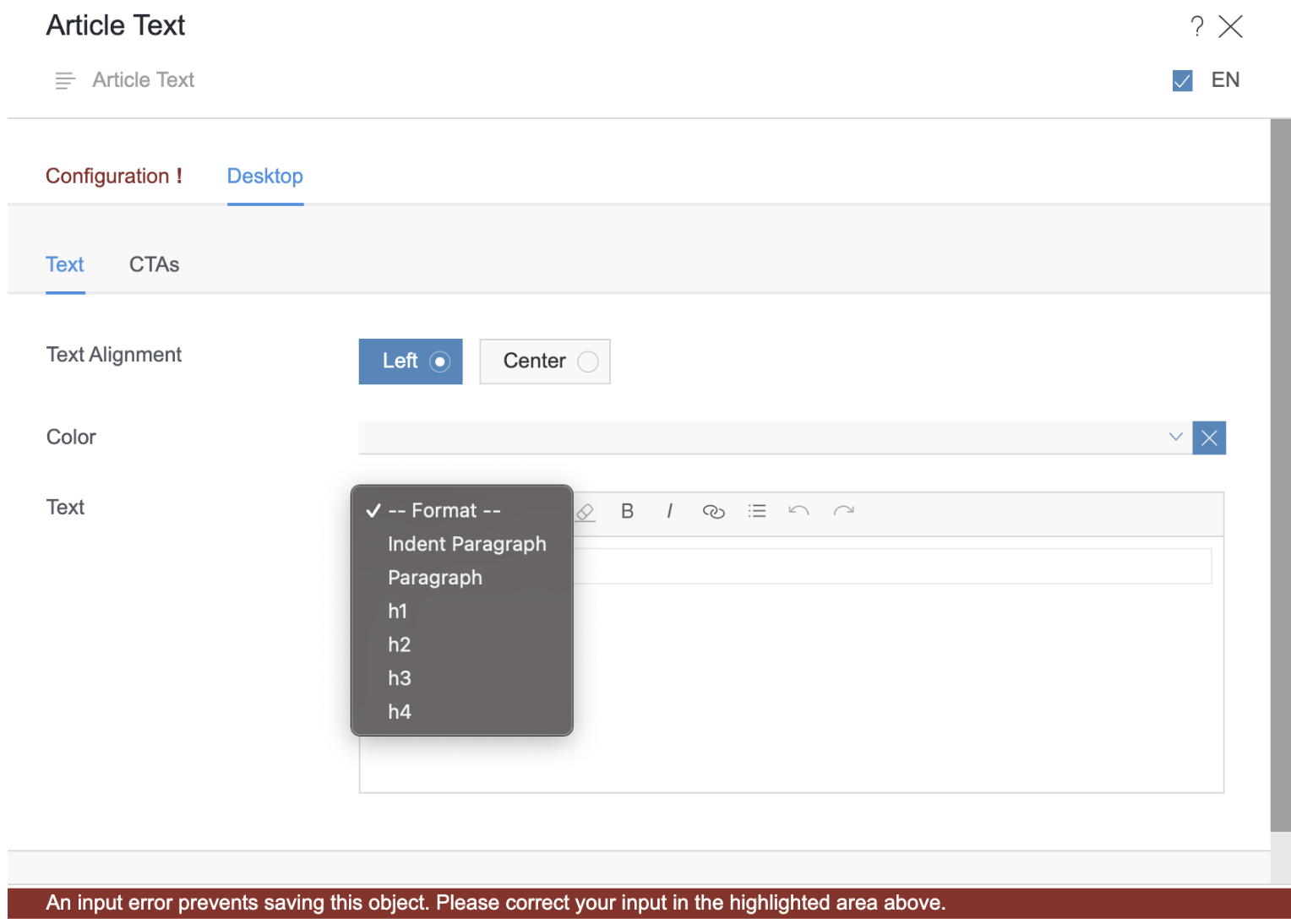
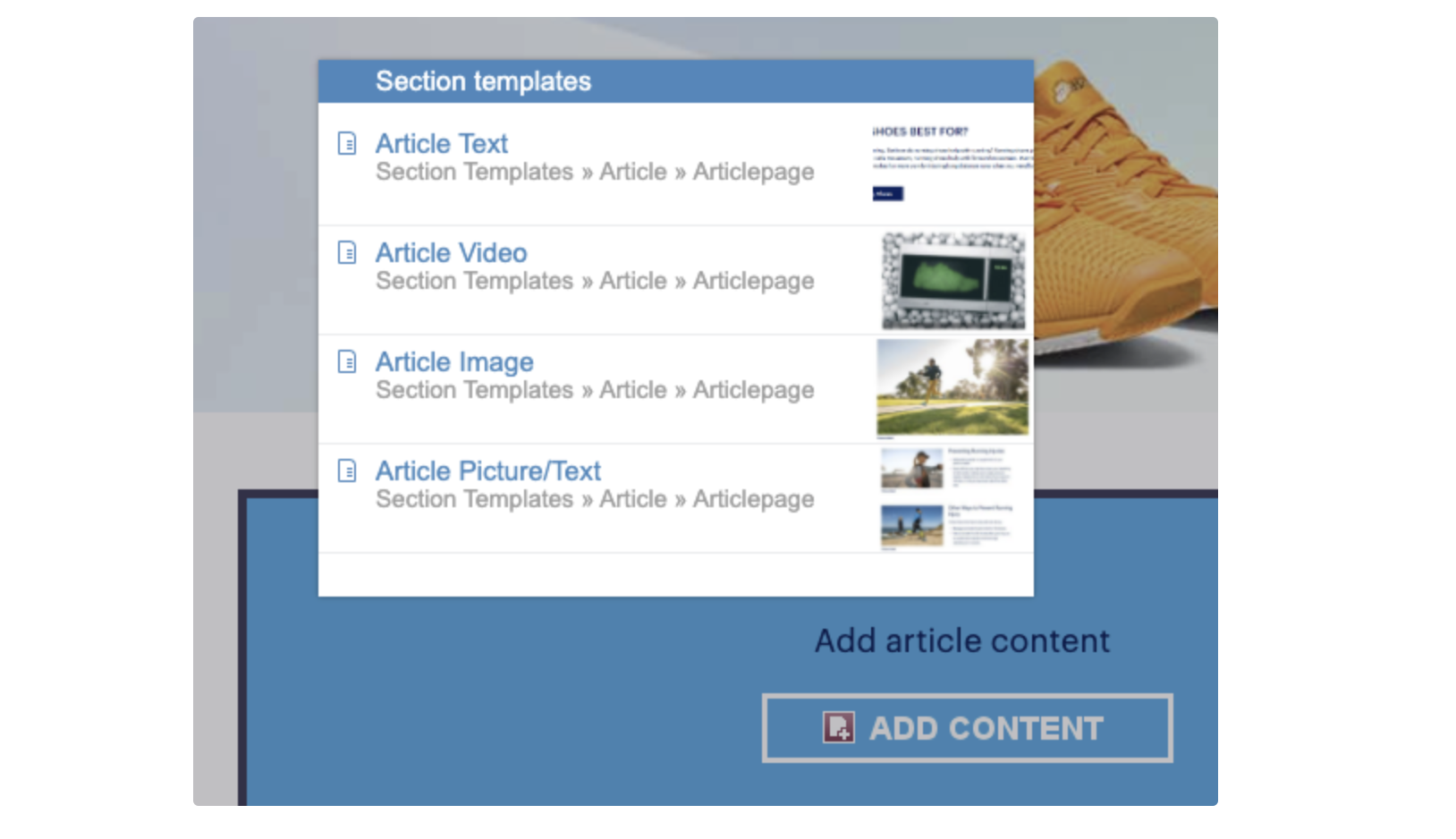
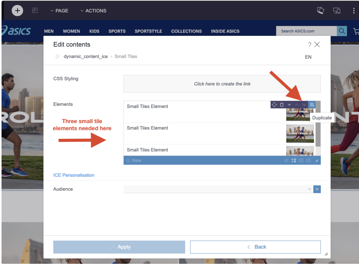
eSpirit: Designing a new CMS
In addition to designing a new blog landing page and article page, we had recently implemented a new CMS called eSpirit to improve personalization, customization, flexibility, and ease of use for our regional businesses. This CMS proved to be a bit more complex than we had previously thought, and required designing capabilities, rules, and the tool’s UX as well.
-
![]()
Design Options
To make applying the design more efficient, I provided default design settings. However, I also provided alternative setting sand layouts if the content type needs more flexibility.
-
![]()
Text Block requirements
Here I added the text sizing and hierarchy for a standardized article design. Each text class has a default style, color, and size.
-
![]()
Designing for Efficiency
Standardizing content unit names/labels for easy application. The business can also select their media type here.
-
![]()
Rules & Requirements
In this training documentation, I have outlined rules and guidelines to the use of content units according to the design.
Revisiting the design
Improving Search and Discoverability

Filtering and Categorization
A higher scope feature we wanted to add to this design was the use of filters to help categorize the content of the blog articles.
Blog (U.S.)
Seasonal topics (e.g., events)
Product reviews and updates
Industry news & trends
Inspirational topics
Tips
Requirements
should be frequently updated, shorter form
Resource center (EU)
Evergreen content
How to’s
Long-form guides
Checklists and plans (e.g., marathon training plan)
Requirements
more selective, less frequent, higher quality
remains relevant over time
Using Data and analysis to inform the design
Along with the research and audit I had done across other blogs and websites, I worked with the SEO team to understand the best use of keywords for filtering - and how to design for successful SEO.
Use categories as the primary method of organizing blog content
Optimize category titles, URLs and content with unique keywords
Limit the number of categories (e.g., max. 8)
Use tags/filters for UX reason only. Tags should be used to provide further definition beyond categories.
Design Considerations
Because of our cross-category article content (i.e. an article about pronation types could be applied to both “Product Recommendations” and “Running Advice categories), there was also the ability to tag the article with multiple sub-filters to further narrow down the search.
For example, Dr. Metzl is an esteemed medical scientist in the fitness industry, and our marketing team wanted to promote his series of articles/videos. The category for the series was placed under the “Training Tips” category, and we tagged the article with the sub-filters “Train with Dr. Metzl” and “Injury Prevention”.
Making it all come together
Ultimately we implemented both categories and filters to solve for organizing our content. To add hierarchy, we used visually different elements; such as circular images for the categories and “pills” for the filters. Because there were a maximum of 8 categories, this worked well within the space. Because we expected to use many filters for each category, a sliding “filter pill” design worked best below each category once it had been selected.

Next Steps
As we continue to produce more content for the Blog, we will continue to gather data, test, and find ways we can help and inspire our ASICS community.
In the future, we would like to:
Add a calendar of races and ASICS-sponsored events
Integrate with our Runkeeper running app to connect and inspire new users with our brand
Add recommendation engines with similar content to each article to further personalize the experience
Add keyword search functionality (if we find it useful for our users)