Helping people find the right shoe for their personal needs by reimagining the ASICS Shoe Finder quiz experience.
Shoe Finder 2.0

Project Summary
Hypothesis
Shoe Finder has proven to be a value add to the Performance Run business. We believe there is an opportunity to drive even better results for our business, and our customers.
The Team
My role: Lead Product Designer
Product Manager: Annette Lamb
Project Manager: Melissa Reed
Engineer 1: Justin Abercrombia
Engineer 2: Andrew Ma
Engineer 3: Ankit Naveer
Illustrator: James O’Connell
Design Tech Stack
Figma
Protopie
CMS Integrations:
Salesforce Creative Cloud
Contentful CMS
Algolia
Salsify
Goals
Customer Goals
Modernize and improve customer experience
More personalized questions and results
Business Goals
Increase quiz completion rate
Increase Add to Cart Rate
Increase Conversions
Technology Goals
Less development investment for changes/optimizations
Build for scalibility (additional categories, headless experience)
Previous Experience
The previous shoe finder experience was based on a 3-step process that was delineated within the store experience. It was part of the in-store wall playbook to help customer narrow down on what they want from their purchase.
-

In-store Experience
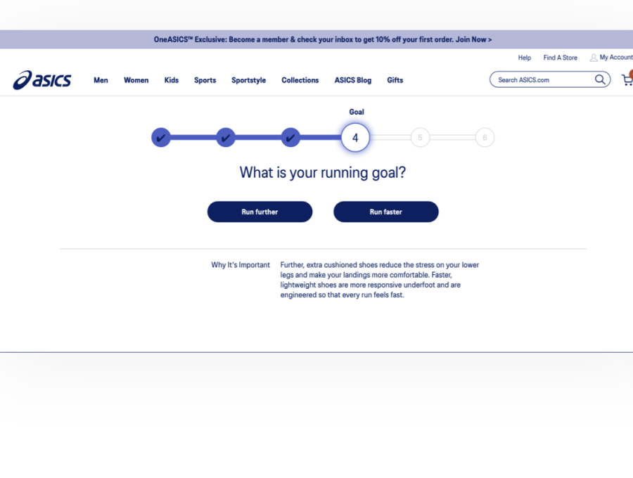
Shoe Finder was inspired by a marketing campaign and sales tactic called “Win the wall”. The goal was to simplify the decision process of finding the right shoe by focusing on whether the customer wants to run “Futher” or “Faster”.
-

Digital Experience
While this may have been helpful for the in-store experience, it proved to be much more complex when transferred to our eCommerce experience.
But there are a lot of things additionally happening in the store that that are much harder to replicate digitally:
The customer has all color ways and models exposed to them at once.Store associates can help guide the customer through the 3 main steps, while also including 7+ other steps that they take on their own. These include evaluating height/weight, injury, foot and arch shape, current shoes, etc. The customer can physically try on the shoe to gauge fit and comfort.The customer is surrounded by artifacts and branded representations of the sport they are pursuing. The floor might be shaped like a track, there may be mannequins in a runner stance and images of pro athletes getting ready to move. All of these peripheral suggestions put the customer in a heightened sense of awareness of the actions or purchases they are trying to make.


Research and Discovery
Research Inputs
35 customer interviews were conducted during the ASICS America experience benchmarking and Shoe Finder specific inquiries.
A Site Intercept Survey was also triggered after the existing Shoe Finder interaction on both ASICS America and ASICS Japan
AJP – 1241 responses
ANA – 274 responses
Internal interviews:
Performance Run Category
Customer Service team
Retail store visits for in-person shoe discovery and expert guidance sessions
Motivational and Behavioral insights on ASICS Segments (Fitness Runner, Run Sensi.. Etc.) from the Marketing Intelligence reports by The Mix

Competitive Research
We needed a new decision tree for our digital experience. So starting from scratch, I began my research with some competitive analysis of other brand shoe finder experiences. From there, I worked with our Consumer Insights team to pull a list of ASICS customers who had purchased shoes within the past 0-3 months and scheduled 30 minute interviews with each of them. I ended up interviewing 10 customers and giving them tasked-based instructions, all the while learning which types of experiences they enjoyed and what they didn’t like. People favored the more personalized quiz-like experience from Brooks. The least favorite experience was a filtered-down product listing page, such as OnRunning.
Personas
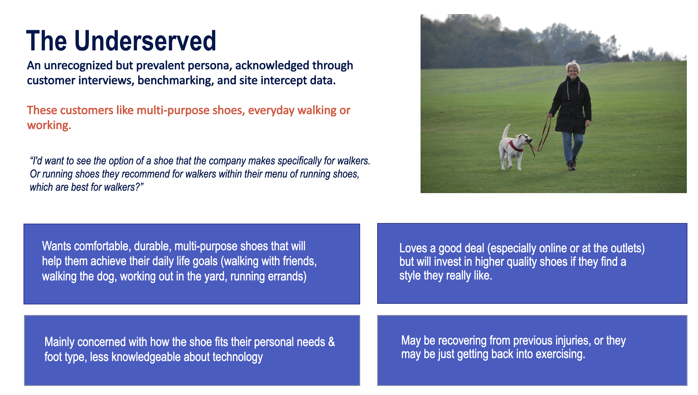
Acknowledging a New Persona: The “Underserved Walker”
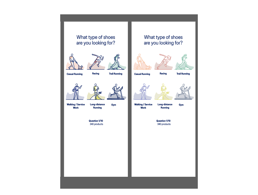
From our research, we learned that not everyone coming to our shoe finder experience is a self proclaimed runner! In fact, up until this point, we had only been catering to our runner personas. We were able to add more categories to our quiz that also reached our “Underserved walker” persona, as well as people looking for general fitness/gym shoes.

Building Trust
Comparing our market segments and personas provided an incredible opportunity to help those who were looking for a more inclusive quiz experience and more versatile shoes. For example, each of our personas care about injury prevention - yet nowhere in the previous quiz did we mention anything about injuries. Only one of our personas consider themselves a runner - yet the only type of shoes we were offering were specifically running shoes. By listening to our users and considering their needs, we were able to find new ways to also help build trust in ASICS as a brand; of caretakers for a sound mind in a sound body.

Key Insights and Takeaways
With consumer benchmarking data and learnings from from customer research/interviews, the Consumer Insights team and I compiled a list of insights and takeaways of why people user shoe finder, and what it is they care about most. We also worked with our customer service team as well as our Performance Run Category team to learn what our customers’ pain points were, and how we should talk about our shoes. We learned about great opportunities to improve the content and flow of our quiz to help make it more inclusive, and also help build more trust in ASICS as an expert in the fitness industry.
A New Decision Tree
Our insights and research helped us chart a new decision tree to inform and guide our questions
-

New Decision Tree
-

Previous Decision Tree
Question Flow: Design Jam Workshop
Together with the Consumer Insights Team, we charted our new decision tree and question flow. Each flow had similar question types, and it became clear our questions could be grouped into “themes”. Each person also had different ideas for GIF and video technologies to help explain more technical terms; i.e. a 3-d rotational image of the shoe with hot spots explaining the technology, or a video example for pronation types. Unfortunately, we ended up having to cut our ideas for video files as it was out of scope for the project; but definitely something we want to include in the next version of shoe finder.

Ideation
While working on designing the template for the quiz and results page I also worked with a contracted illustrator out of Manchester, UK to help bring animation and delight to the experience. This was the first time we were introducing illustration into the ASICS brand, and we did this to help with diversity, inclusion, and give a visual sense of understanding to heavy text-based or technical terms.

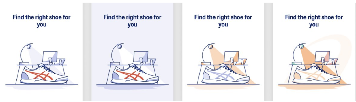


Exploring use of colors, illustration

Content unit Wireframes / Design
Results Page: Wireframes
Perhaps the most crucial optimization we made is the results page. Customers were confused and overwhelmed with the number of results on our previous results page, sometimes spanning up to 3 pages of products! How are our users supposed to be able to trust the options. we give them if they have to work to narrow their options down? W learned that the sweet spot of results our users wanted to see was between 3-5 products. Rather than just a product listing, our customers also wanted to know why we were recommending those products.

Results Page Concept (Desktop)

Results Page Concept (Desktop)
User Testing High Fidelity Mockups
After multiple feedback sessions and iterations, our mocks were optimized to a point where we were able to begin user testing with a high fidelity prototype. The parameters were similar to user interviews; OneASICS members (U.S.) who had made a purchase from asics.com in the past 0-3 months.

Repurposing UI from other places on the website helped us speed up build time.
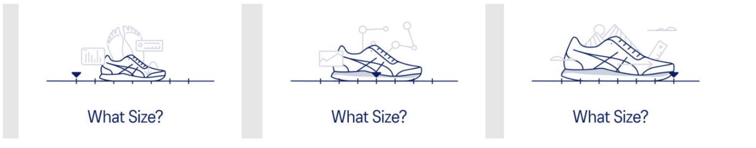
Despite this being an entirely new, headless, experience, I wanted to utilize as much as I could from the asics.com website to simplify the build process. For example, the size selector UI was designed to match our Product Page, making it a simple template for our engineers to create.

Users really enjoyed the ability to jump straight to the end if they felt they had. answered enough questions to receive a desired result.
Users were confused by what the arch question and injury prevention question would provide - they didn’t want to give out any additional information without knowing how it would help them.
We ultimately combined the arch question with the pronation question as they both map to the same tag in the backend.

Users didn’t like the hot spots on the actual bones - it conveyed more bone fractures than muscle pains, which is not our intention. We ultimately needed to remove this question as recommending products that could potentially eliminate pain caused legal difficulties.
Users loved the animations and how we group colors into neutrals vs. bold and bright. We found that user who were purchasing shoes for a race would select the “bold and bright” colors, and users who were looking for everyday shoes to go with various outfits chose. the neutral pallette.

We also ultimately needed to remove the OneAsics sign-in page due to scope limitations, but we generally received positive feedback on this page and it provided us with great learnings for when we are able to implement it.
Users appreciated the results page ; 3 products, with. scannable information/icons to help them decide if the shoe is right for them before having to click into the product page.
Next Steps and Future Enhancements
In the future, we want to expand to other categories in addition to Performance Run. We are currently working with the ASICS America team to gather as much data and analytics as we possible for the next month and are in the process of testing for user feedback. We will be paying close attention to and collecting data on quiz completion, add to cart, and conversion rates.
Customers originally hoped we would include video content and examples of pronation as it is a difficult concept to articulate, without going to a professional running store and getting fitted. Instead, we utilized educational content from our blog, provided the main learnings of how experts communicate ways to understand pronation type (wear pattern of shoes, arch type, etc)
Information about Injury Prevention
Dynamic Flows
Quick Add to Cart from the results page